 "Amoore100" (amoore100)
03/31/2016 at 22:32 • Filed to: Design Details, Alfa Romeo, Tesla Model S
 3
3
 48
48
 "Amoore100" (amoore100)
03/31/2016 at 22:32 • Filed to: Design Details, Alfa Romeo, Tesla Model S |  3 3
|  48 48 |
From basic economy cars evoking ideals of youthfulness and practicality to stately saloons meant to ferry around executives, most automotive models have always been embellished with some form of a name. These names are very much a part of the cars themselves and are often portrayed in a manner which represents the overall character of the vehicle. Which of these badges are the most interesting? That’s up to you to decide.
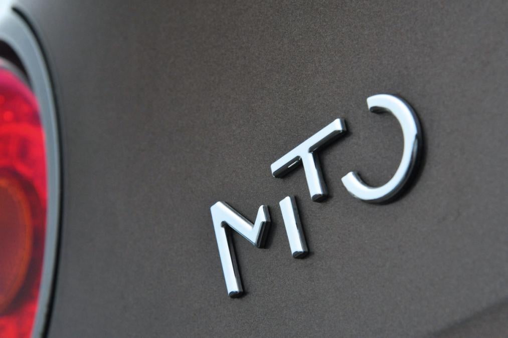
Funky, stylish ‘Mito’ badging on an Alfa
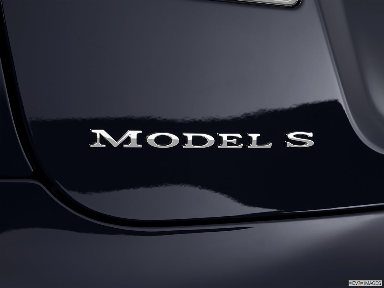
Rather boring serif typeface on a Tesla
So what do you think Oppo?
What are the best/worst/most distinctive model-name badges in the automotive world?
Inspired by this old Jalop article:
!!! UNKNOWN CONTENT TYPE !!!
 bob and john
> Amoore100
03/31/2016 at 22:34 |
|
the orange peel on the model S is real.
 Chan - Mid-engine with cabin fever
> bob and john
03/31/2016 at 22:36 |
|
Not too far off of any other modern car with water-based paint.
The old cars with lacquer-based paints were better.
 not for canada - australian in disguise
> Amoore100
03/31/2016 at 22:39 |
|
I quite like the badges on the Kia Soul.
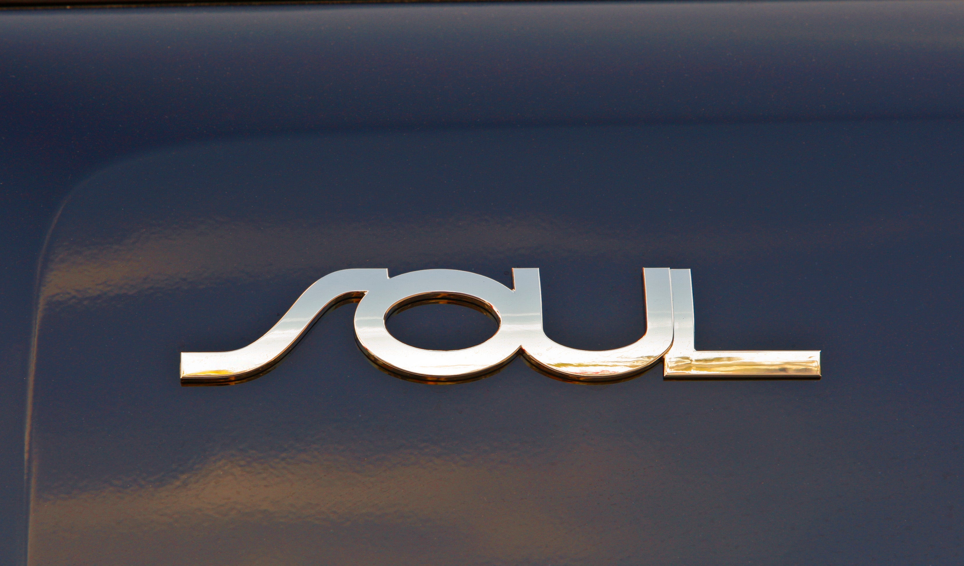
It’s a very simplistic, yet pleasing, design.
 My citroen won't start
> Amoore100
03/31/2016 at 22:43 |
|
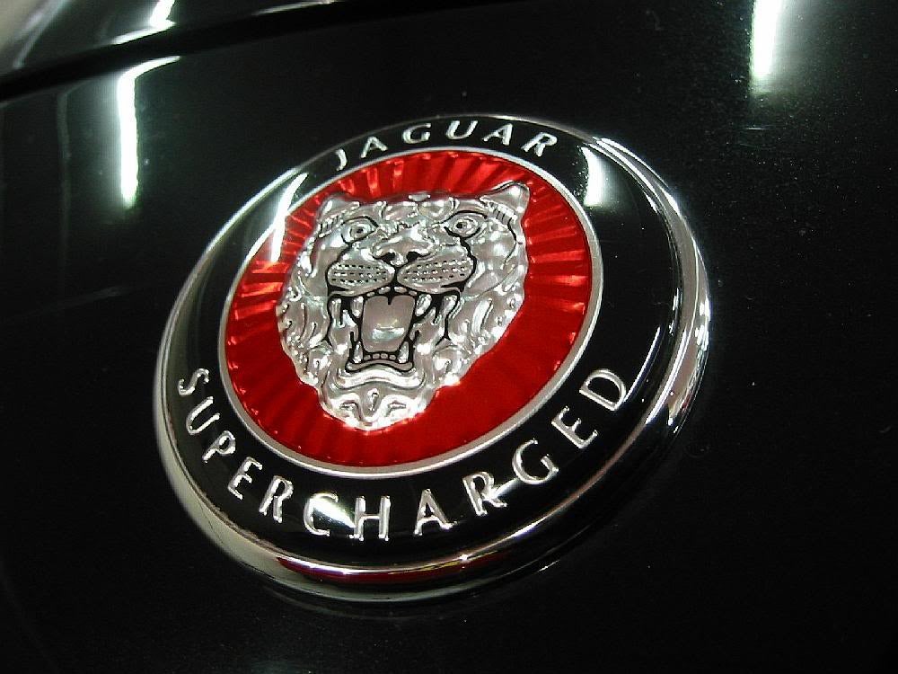
GET OUT OF MY WAY
 OPPOsaurus WRX
> Amoore100
03/31/2016 at 22:44 |
|
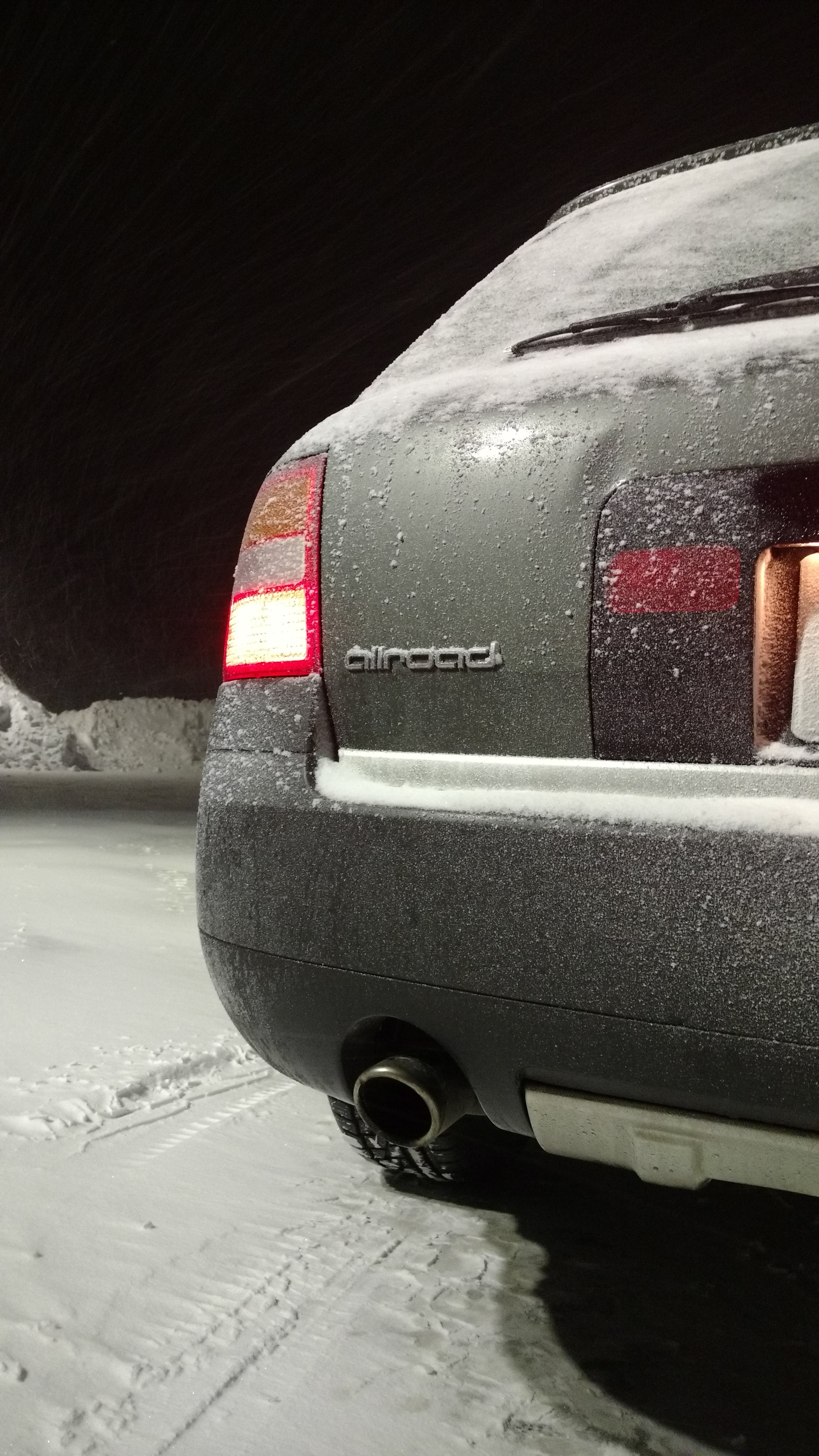
I like mine. It’s also one of the few Audi’s with an actual name.
 interstate366, now In The Industry
> Amoore100
03/31/2016 at 22:47 |
|
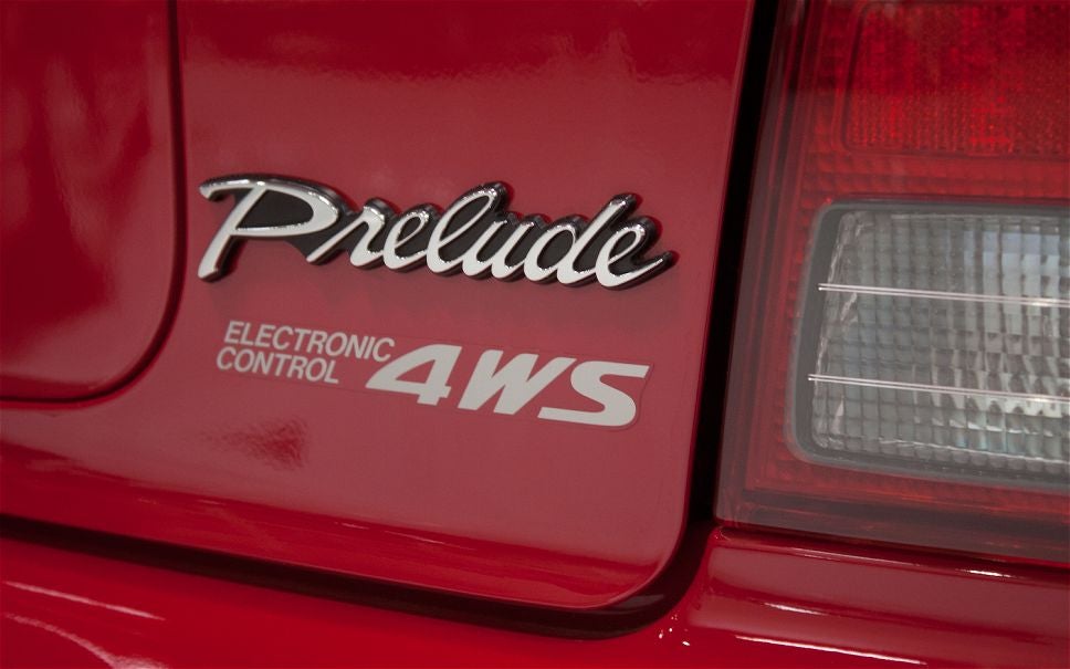
The 4th gen Prelude’s badge was significantly different from the rather normal looking ones of the other generations.
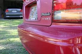
 Amoore100
> bob and john
03/31/2016 at 22:48 |
|
Definitely, I saw that when I chose this picture and was surprised that this level of quality was acceptable on a $70 grand car, but then again it is American.
 Amoore100
> OPPOsaurus WRX
03/31/2016 at 22:49 |
|
Indeed! Invokes the Quattros of yore.
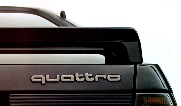
 Amoore100
> My citroen won't start
03/31/2016 at 22:49 |
|
A logo more than a badge, but I’ll let it pass this time. Save the rest for next week, though!
 Amoore100
> not for canada - australian in disguise
03/31/2016 at 22:50 |
|
Agreed! It’s almost as if they used a tilde instead of an ‘S’ and it has worked out quite well IMO.
 My citroen won't start
> Amoore100
03/31/2016 at 22:50 |
|
It was more about the Supercharged bit.
 If only EssExTee could be so grossly incandescent
> Amoore100
03/31/2016 at 22:54 |
|
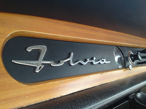
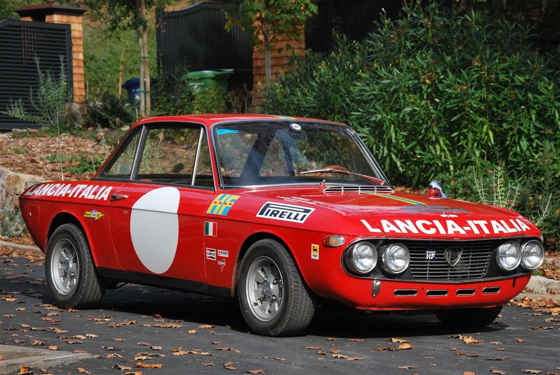
Looks like someone took a pen full of liquid metal to paper.
 Jake - Has Bad Luck So You Don't Have To
> Amoore100
03/31/2016 at 22:55 |
|
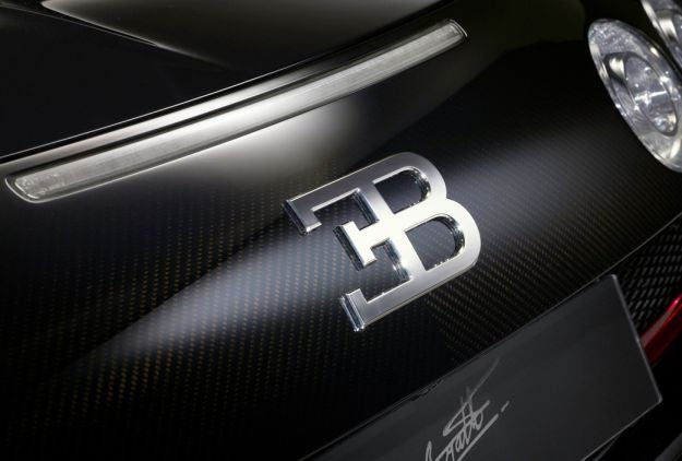
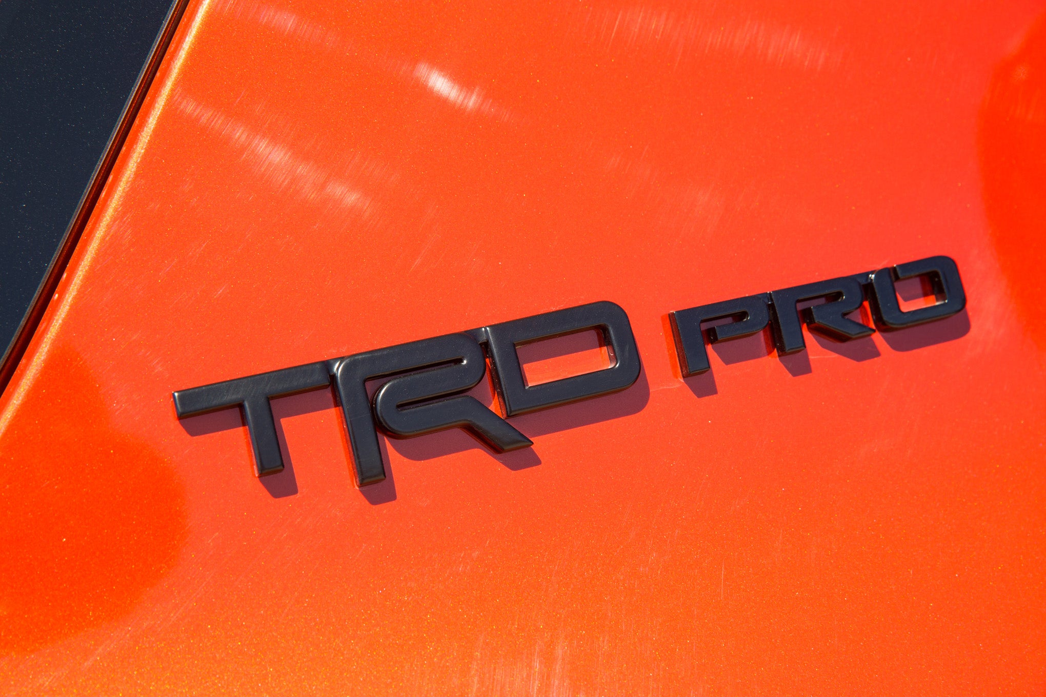
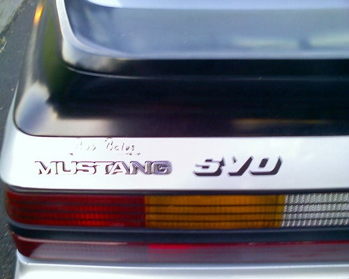
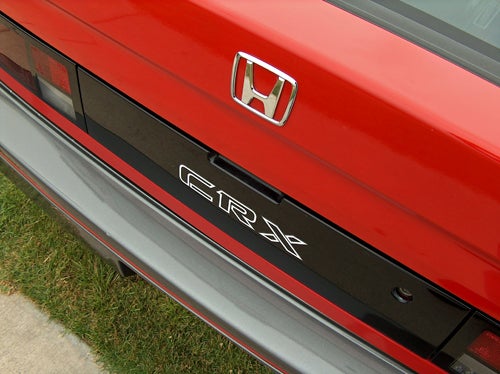
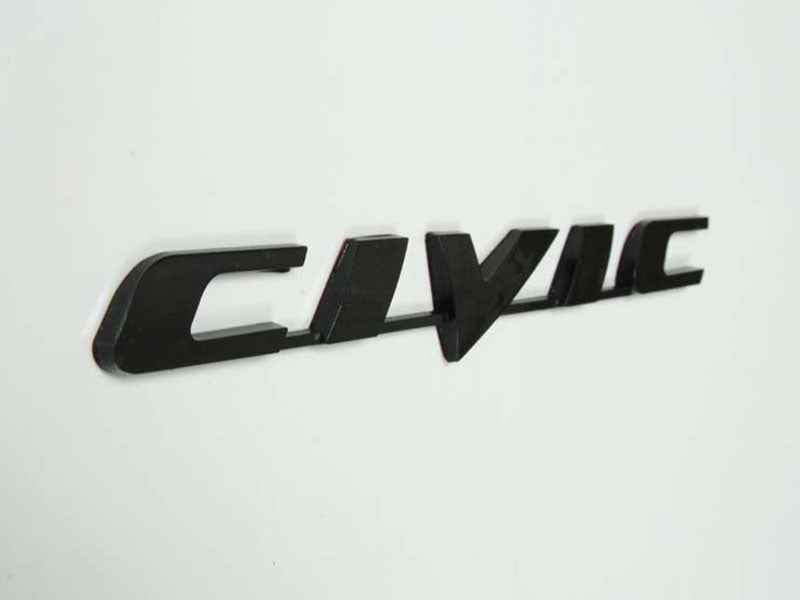
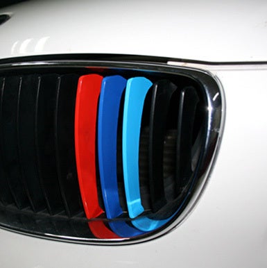
Also whatever this is called. I love seeing this on M cars.
 bob and john
> Chan - Mid-engine with cabin fever
03/31/2016 at 22:57 |
|
look at the mito. its sooo nice compared to the tesla
 Amoore100
> interstate366, now In The Industry
03/31/2016 at 22:59 |
|
It’s in cursive and had 4WS! What more could you ask for?
 Amoore100
> Jake - Has Bad Luck So You Don't Have To
03/31/2016 at 23:01 |
|
Bugatti is a logo more than a badge, but the others are all excellent!
 Amoore100
> If only EssExTee could be so grossly incandescent
03/31/2016 at 23:02 |
|
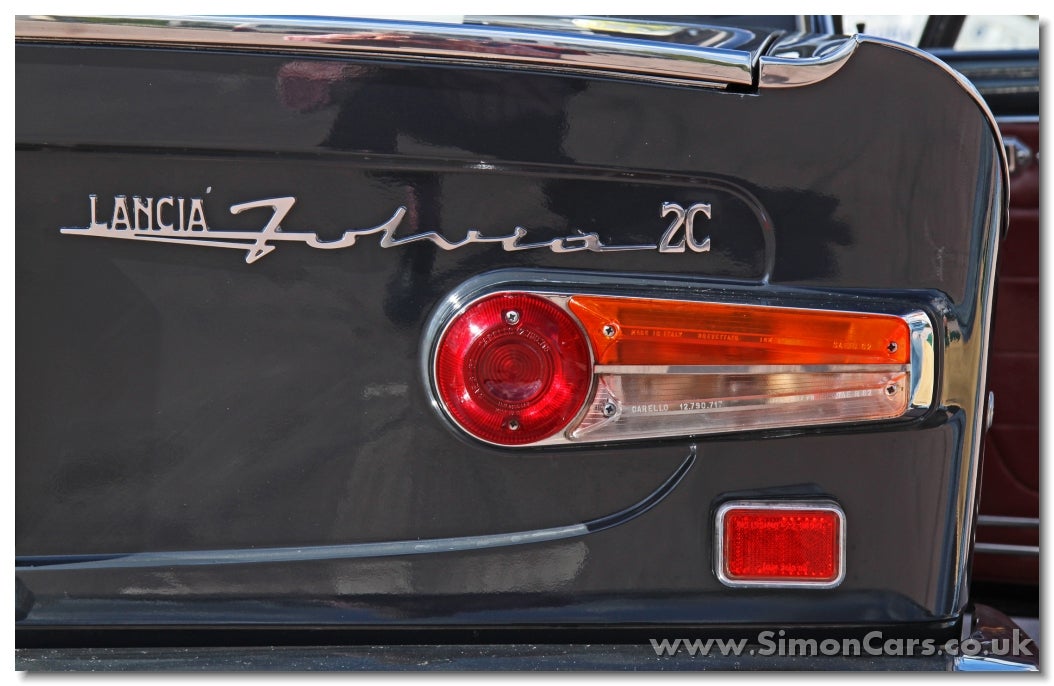
Stunning. It’s like the car’s signature.
 Amoore100
> My citroen won't start
03/31/2016 at 23:03 |
|
A very British typeface indeed.
 interstate366, now In The Industry
> Amoore100
03/31/2016 at 23:06 |
|
If said 4WS could actually work properly, that would be great.
 AMC/Renauledge
> Amoore100
03/31/2016 at 23:24 |
|
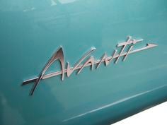
Winner, winner chicken dinner.
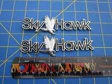
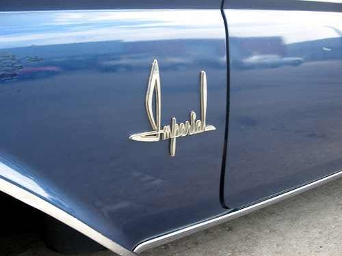
 Birddog
> Amoore100
03/31/2016 at 23:25 |
|
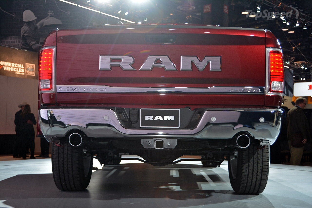
I like the Model S badge for it’s U.S. 1940s style of simplicity. I could see Guy Noir, Private Eye tooling around Minneapolis in that. The Alfa? That badge is trying too hard. Like most cars today.
It could be worse though.
 Daily Drives a Dragon - One Last Lap
> Amoore100
03/31/2016 at 23:29 |
|
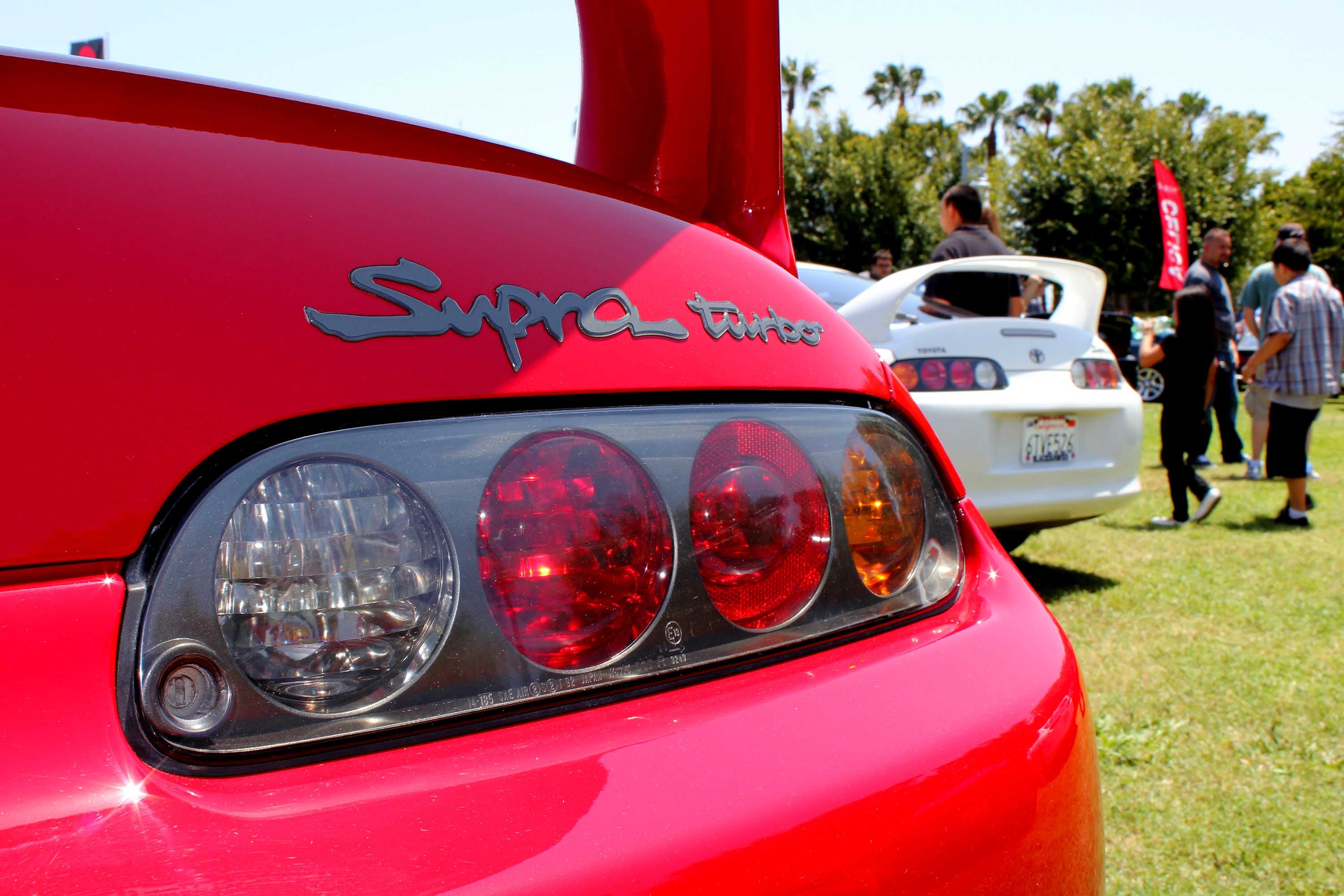
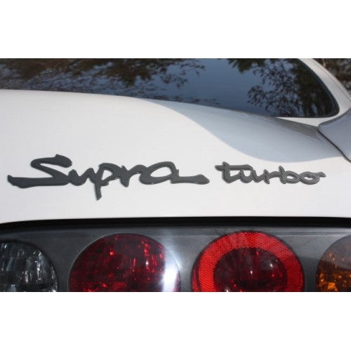
It’s 90's as hell, but I love the Supra Turbo badges
The badge on the Plymouth Conquest TSI looked good too. Very 80's in its type face. Can’t find a good pic. The one below is the best I could do.
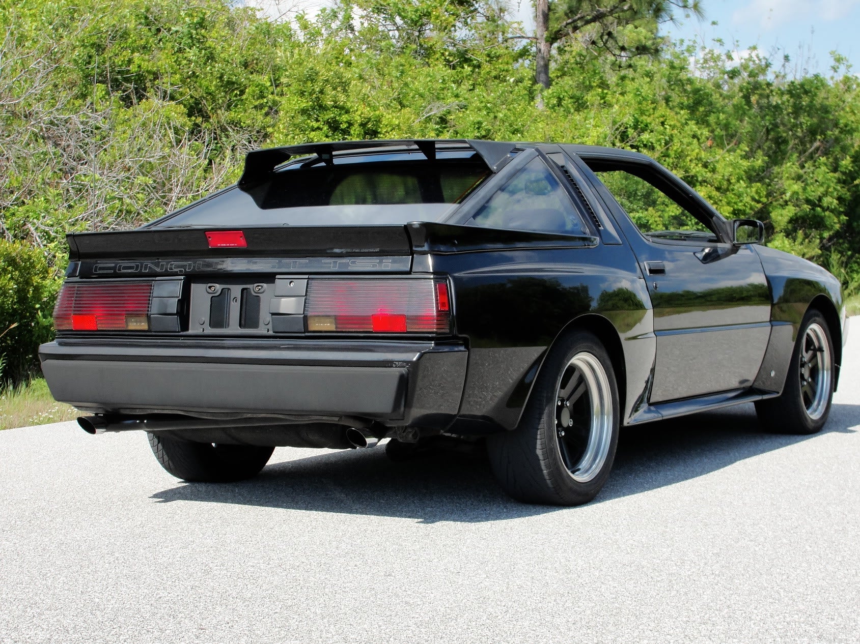
Also, Those box flares. Hnnnggg.
 RazoE
> Amoore100
03/31/2016 at 23:44 |
|
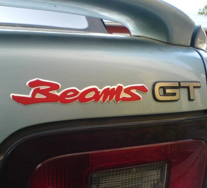
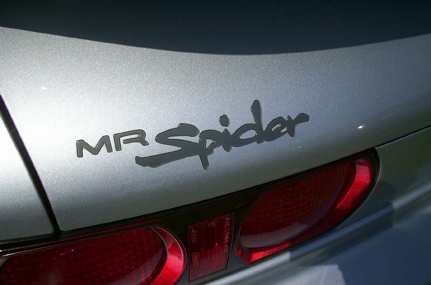
I Always liked this Toyota font
 S65
> Amoore100
04/01/2016 at 00:06 |
|
I Quite Like This One.....
 Amoore100
> Daily Drives a Dragon - One Last Lap
04/01/2016 at 00:29 |
|
The Supra is such a classic, and the badge fits its ragged character well! Also, I went on the internet and found this:
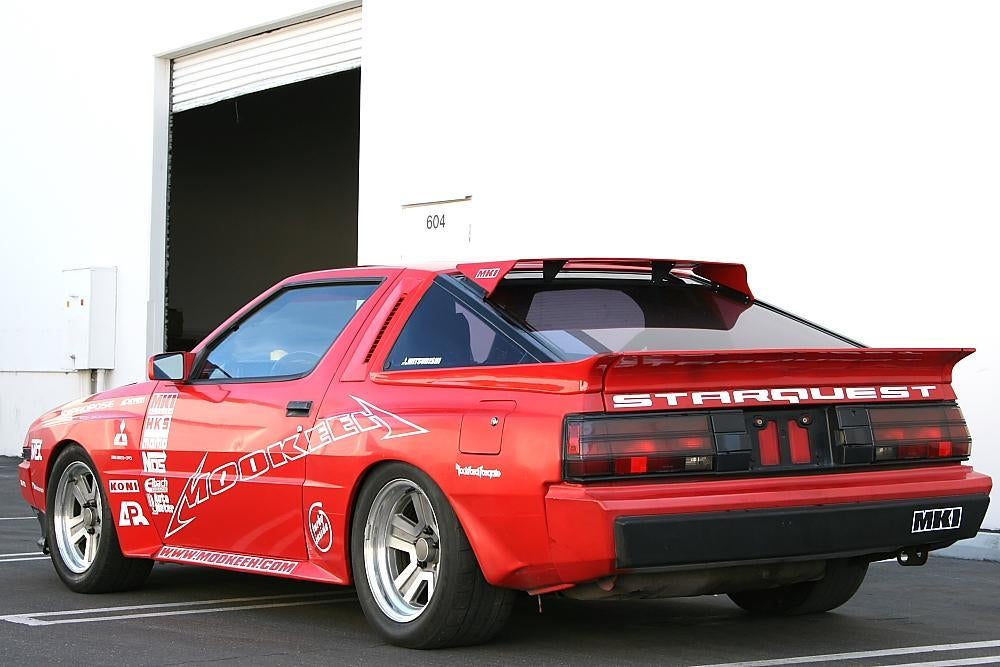
Nice way of capturing the original badging effect while simultaneously referencing both variations on the Diamond-Star Motors theme.
 Amoore100
> AMC/Renauledge
04/01/2016 at 00:31 |
|
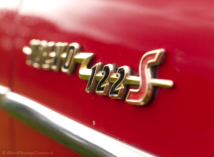
Can’t say no to chrome badging, especially if it’s in cursive, is gold plated, or has an animal in the middle!
 ly2v8-Brian
> Jake - Has Bad Luck So You Don't Have To
04/01/2016 at 00:40 |
|
Yes to all but the T(u)RD badge. Such a stupid name for their ‘performance’ brand.
 Daily Drives a Dragon - One Last Lap
> Amoore100
04/01/2016 at 00:46 |
|
Just needs some louvers.
 Brian McKay
> Amoore100
04/01/2016 at 00:46 |
|
It's obviously a badge on a car.
 Brian McKay
> Amoore100
04/01/2016 at 00:48 |
|
Someone sneezed or had a seizure, as no F was written.
 Brian McKay
> ly2v8-Brian
04/01/2016 at 00:49 |
|
‘Hey; what’re you drivin’ these days?’
‘I got a terd pro.’
 ly2v8-Brian
> Amoore100
04/01/2016 at 00:50 |
|
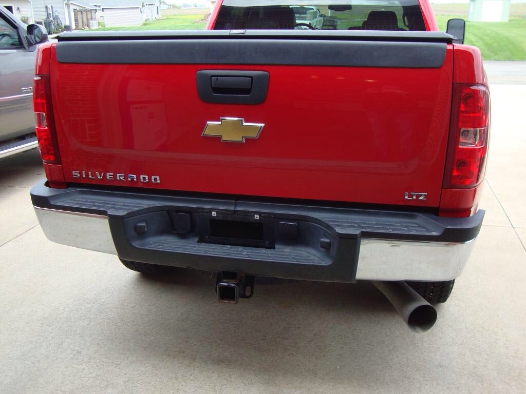
I like the simple lettering on my truck (not mine in pic)
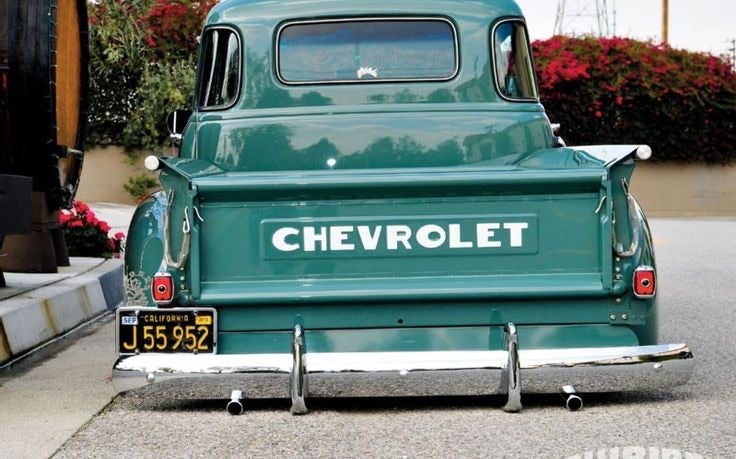
My favorite would be this:
 Amoore100
> Brian McKay
04/01/2016 at 00:50 |
|
Sorry, when I said badge I meant model-name badge to specifically refer to lettering rather than symbols. I apologize if it was unclear before!
 Brian McKay
> Amoore100
04/01/2016 at 00:51 |
|
It’s obviously an insignia, emblem, marque, badge ... and is one if the best that is presented here.
 Wheelerguy
> Amoore100
04/01/2016 at 02:39 |
|
!!! UNKNOWN CONTENT TYPE !!!
Sounds like an excellent sci-fi book.
 Amoore100
> Birddog
04/01/2016 at 03:22 |
|
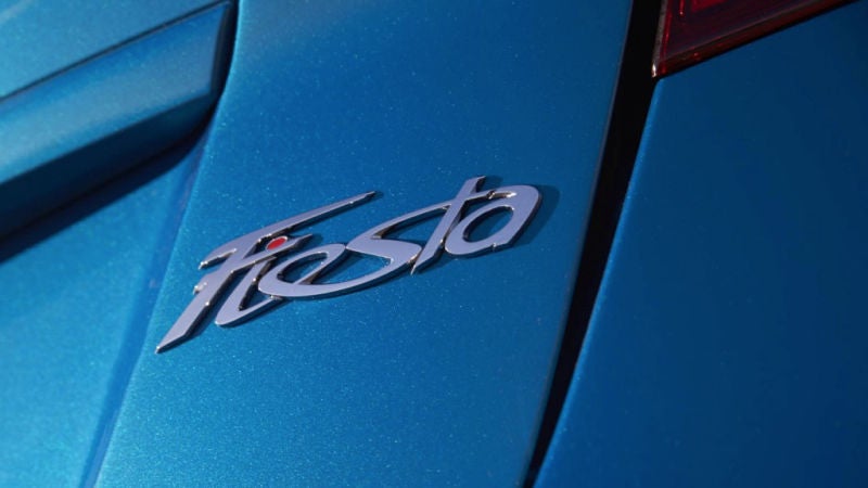
I don’t know, the Tesla just feels too futuristic to have that sort of badging since it doesn’t tie in to the rest of the styling; it would look more at home on a Lincoln. The Alfa, while artsy, is actually one of the better ones IMO because at least it tries a new approach instead of just lazily applying a cursive typeface as they did on the Fiesta.
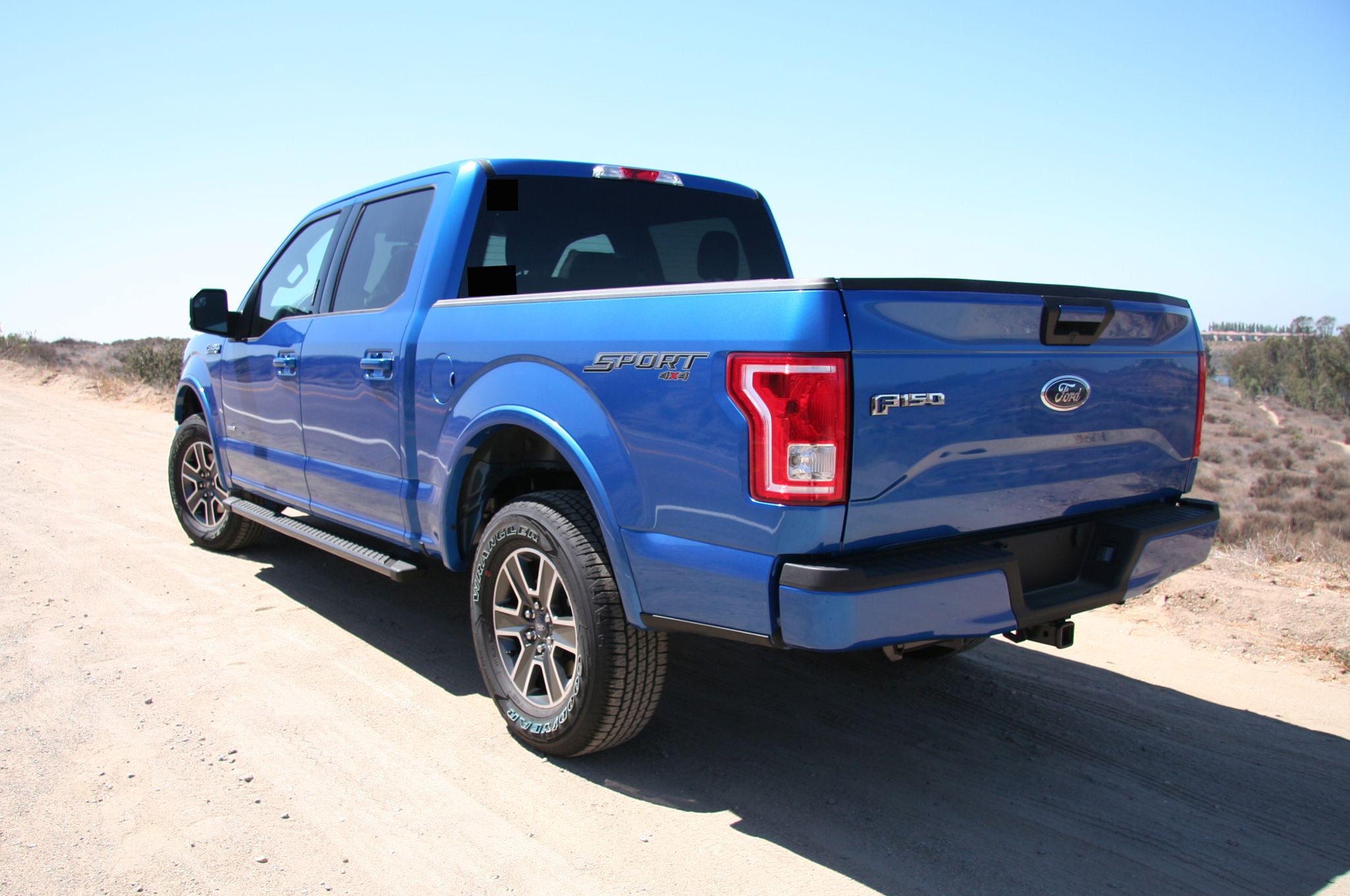
And as for trucks, well, all bets are off there, but the new F150 does an ok job in the badging department.
 Amoore100
> Wheelerguy
04/01/2016 at 03:22 |
|
For some reason I thought it was some sort of ‘80s-’90s video game but Google thinks I’m mistaken...
 Amoore100
> S65
04/01/2016 at 03:25 |
|
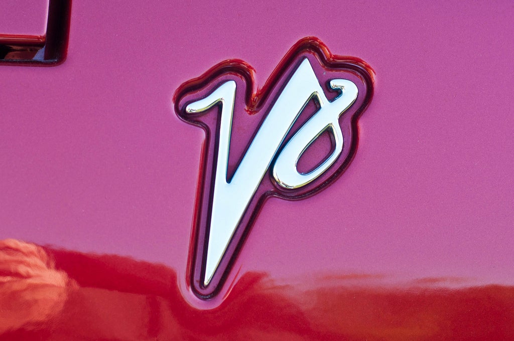
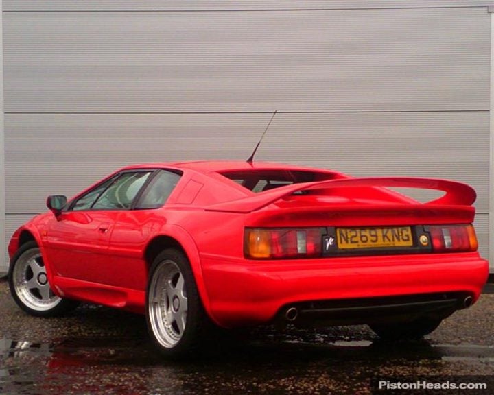
Esprit V8, a la James May Edition! The logo itself always seemed too brash for the car in my opinion, however, because of its jaunty cursive nature in contrast to the subtle and sleeper qualities of the Esprit V8 itself.
 Amoore100
> RazoE
04/01/2016 at 03:26 |
|
Beams? From the taillight it looks like a Celica, but why would you call it the ‘Toyota Beams’? Anyways, it is such a recognizable and characterizable font from that era of Toyota sports cars.
 Amoore100
> ly2v8-Brian
04/01/2016 at 03:29 |
|
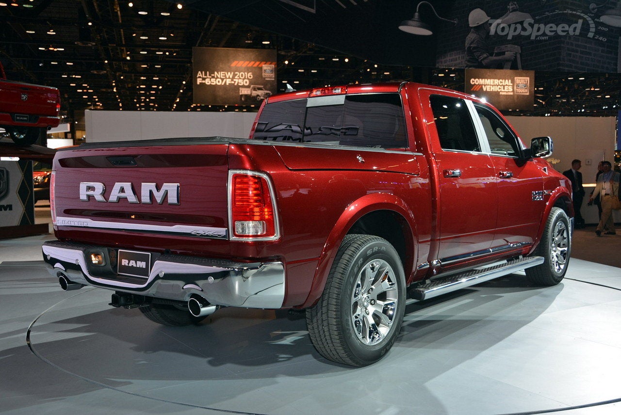
Much better than whatever this is:
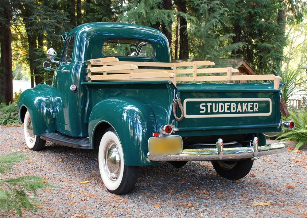
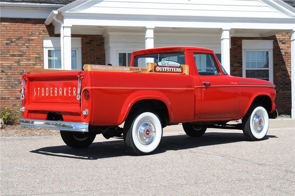
And while I’ve always appreciated Chevy trucks, you just can’t deny the coolness that an old Studebaker oozes.
 Probenja
> Amoore100
04/01/2016 at 06:43 |
|
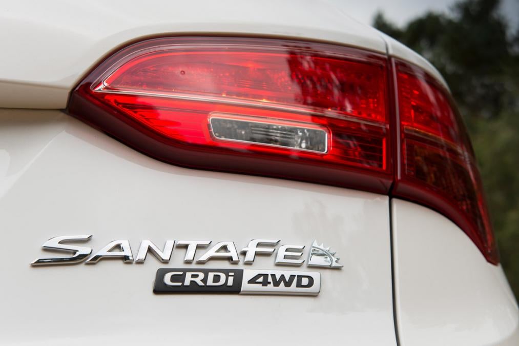
I like the little sun that the Santa Fe has:
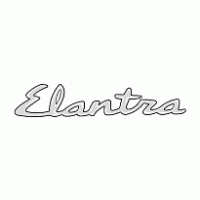
Also old Hyundai’s had a much cooler font:
 RazoE
> Amoore100
04/01/2016 at 09:21 |
|
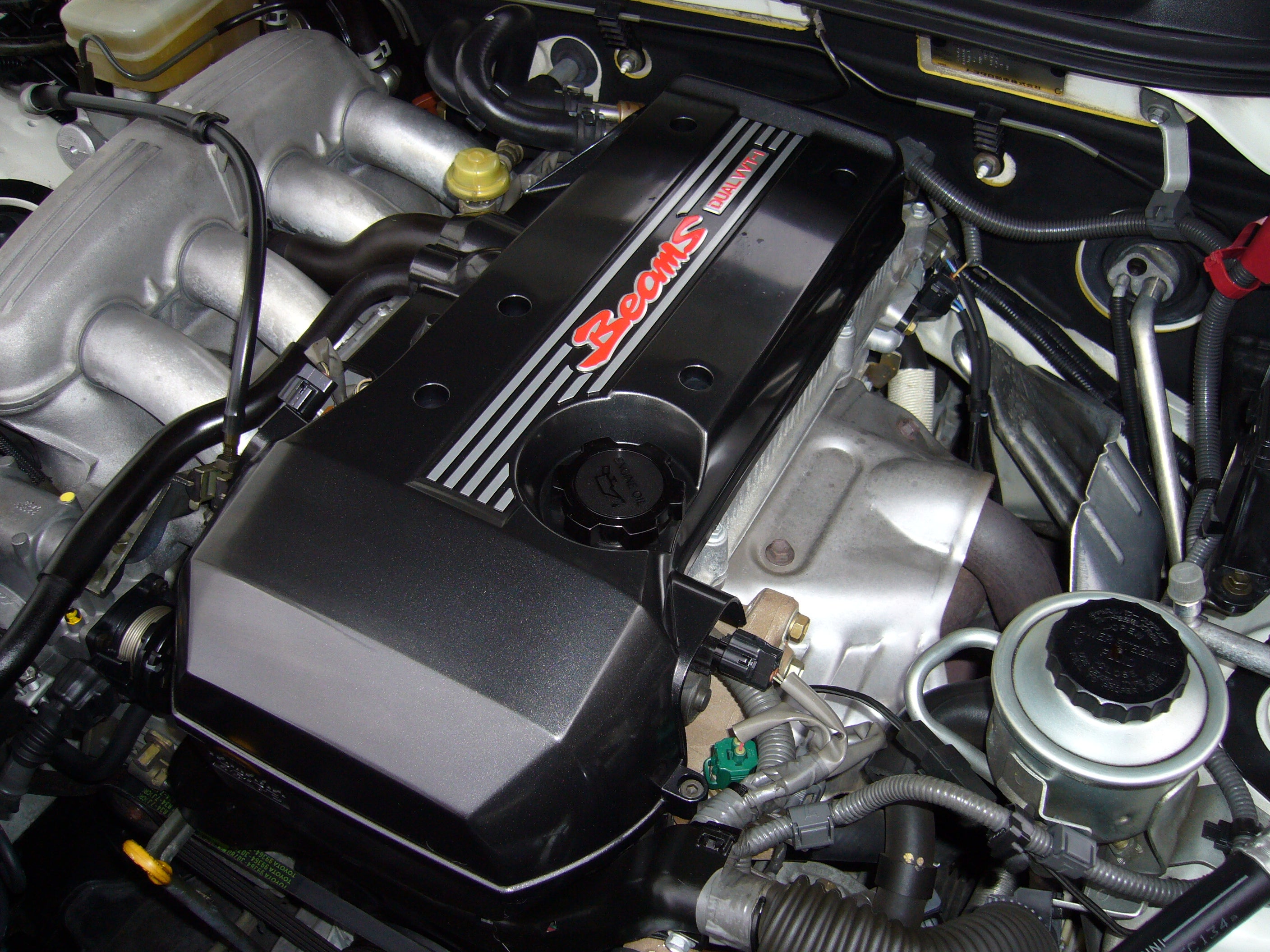
It has to do with the 2.0L BEAMS 3SGE, featuring dual VVTi, pumping out a peak of 209 hp, which isn’t bad for an engine originally from the very early 80s.
 Brian McKay
> Amoore100
04/01/2016 at 12:05 |
|
logotype:

 Amoore100
> RazoE
04/01/2016 at 20:11 |
|
Ah, makes sense. Indeed, 200+ horsepower is pretty good for a NA I4 in general, let alone before the 21st century! Beams is a bit of an odd name still, must have been an acronym for something?
 Amoore100
> Probenja
04/01/2016 at 20:13 |
|
The sun is a great logo for the Santa Fe since it’s such a classically New Mexican symbol. The cursive on the Elantra, though, always seemed a bit cheesy to me. But that might be because old Hyundais were a bit cheesy.
 RazoE
> Amoore100
04/01/2016 at 20:37 |
|
Yup, BEAMS stood for:
B reakthrough E ngine with A dvanced M echanism S ystem
 Amoore100
> RazoE
04/01/2016 at 20:41 |
|
Wow, such a Japanese name. “What should we call the engine?” “Well, it’s our most advanced yet, how about the ‘Breakthrough’?” Perfect.
 If only EssExTee could be so grossly incandescent
> RazoE
04/02/2016 at 20:22 |
|
That typface is like, Solo Jazz levels of 90's.